Girl Scouts | Go Gold Application Website
Girl Scouts of the USA needed to streamline their online application process for their highest award, the Gold Award, to allow girls an easier and more responsive way to prepare and present their Gold Award presentation.
Project Summary
Overall
Girl Scouts needed to revise their Gold Award application experience—Go Gold—so that prospective Gold Award girls could leverage a more stable, usable, mobile-responsive tool in order to complete their application with ease, track its status and access familiar features they were using in other online tools and social channels.
My Role
UX/UI Design stakeholder for project, responsible for overseeing the work of a UX Lead provided by a vendor partner, ensuring that flows, wireframes and interaction design conformed to industry best practices. Additionally, contributed to UX deliverables to redefine some of the vendor's work that failed to live up to the task. I was responsible for working with Business Leads to write and revise user stories and undertake/oversee user acquisition testing.
Going for the gold.
Though I came into the project after the Discovery phase, I took the time to review the original Go Gold web application, read reviews and findings from user groups with Gold Award girls, and review the documentation and proposals provided by the contracted vendor.
Key insights included:
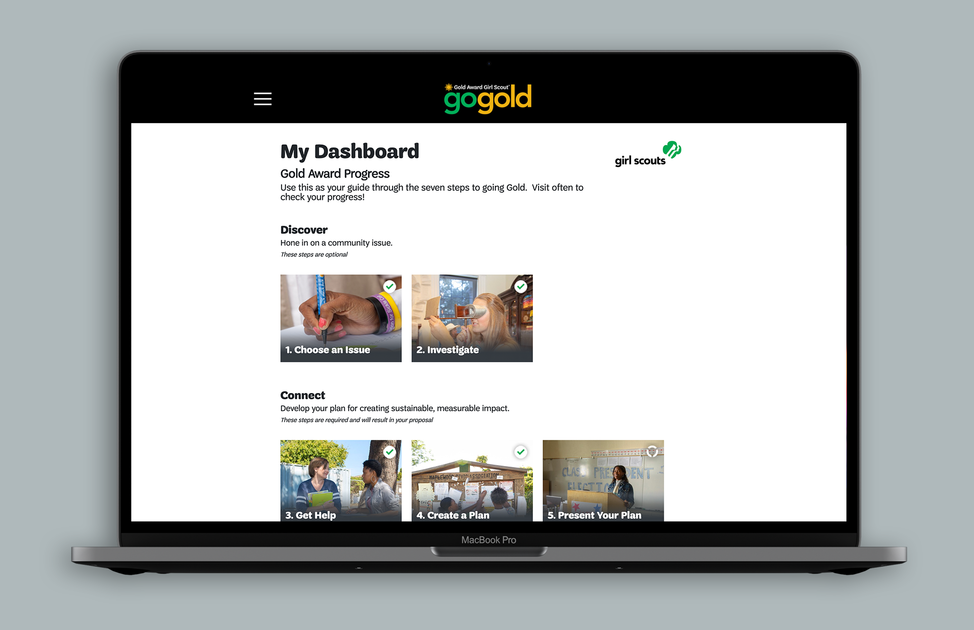
1. A good percentage of the girls felt the application process was overwhelming, hard to navigate and the product itself performed poorly. It was hard to keep track of the status of their application and they hoped for a "home" dashboard by which they could reorient themselves and obtain messaging about their application, its status and where they were in the process.
2. The experience did not work well on a mobile device.
3. Girls wanted additional tools to help prepare their application, such as mind mapping and list building features.
4. According to the Business Leads, the vendor had been chosen for their technical superiority, helping to make the platform stable, though their UX team was admittedly less than stellar.
Polishing some of the tarnish.
Understanding that discovery had been completed, I entered the first day hoping to begin defining what we were building—gathering requirements, writing user stories, building a site map. To our surprise, the vendor led with annotated wireframes, which were reoriented versions of the original site...and none of them were mobile-first. Because the timing was tight, this led to a joint agreement between the Business Leads and myself to undertake a, rapid one-week discovery and definition session with the vendor, and only then capture user stories from agreed-upon requirements. Once the user stories were written, the vendor agreed to pivot to a mobile-first approach and begin the process of recreating the wireframes.
Several key insights stood out:
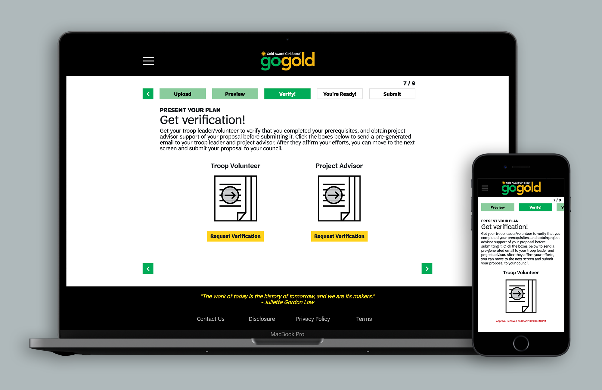
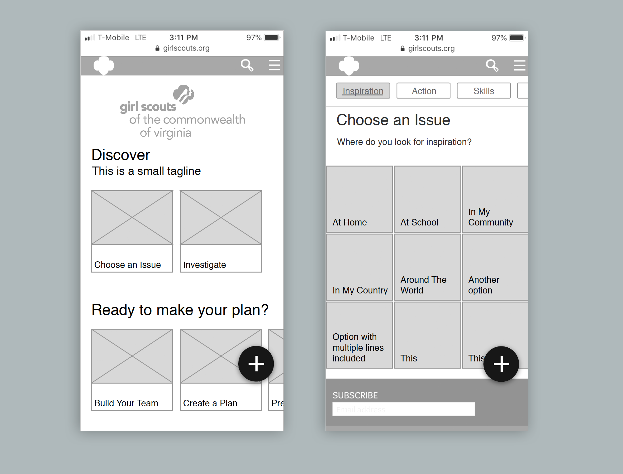
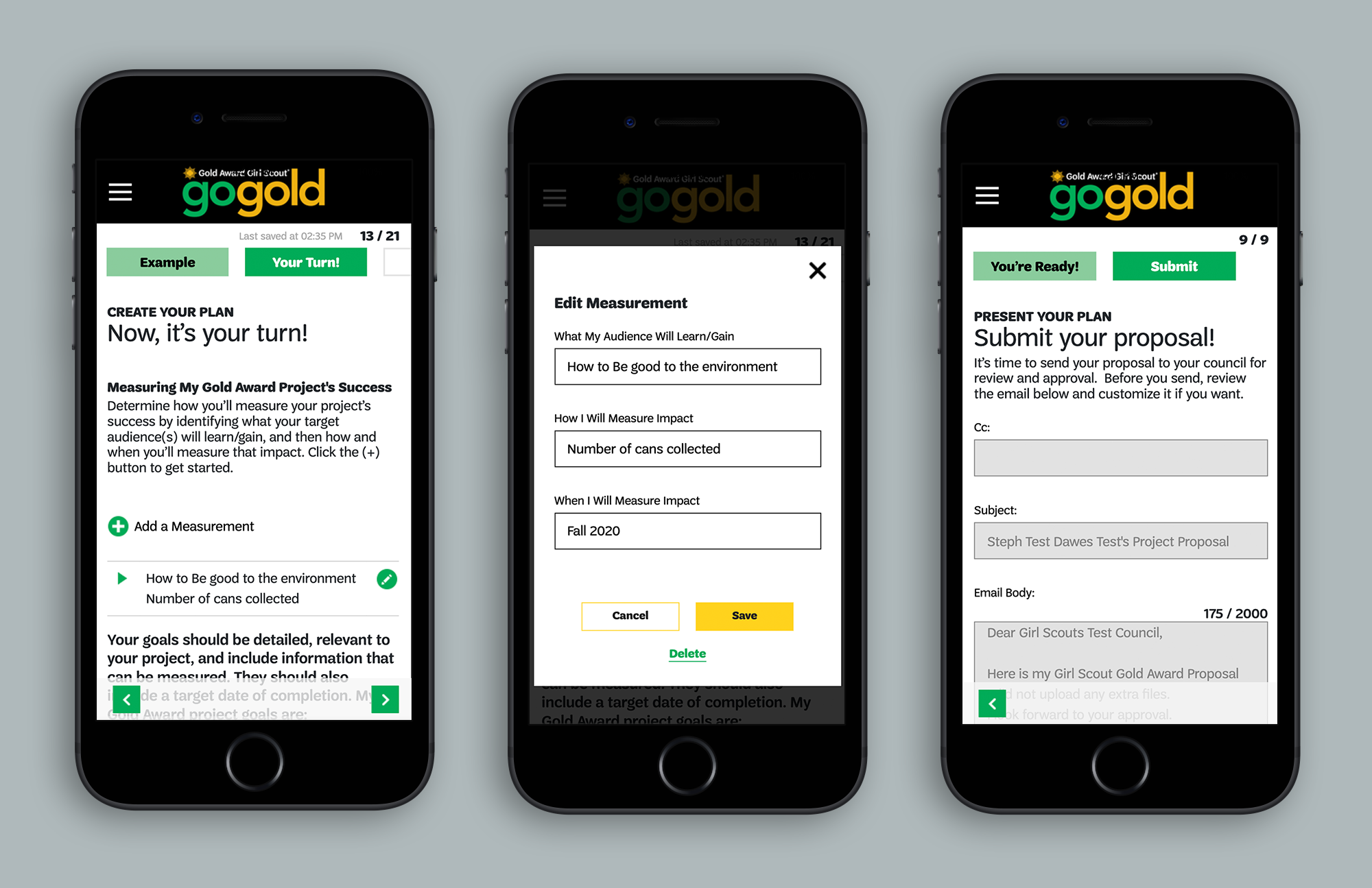
1. Somewhere along the line the vendor started thinking of the product as a mobile app, not a mobile website. They created a carousel-style interaction by which a user could swipe back and forth within a step in the application process...as if the entire step or page was a carousel. Unfortunately, on a mobile browser a back-swipe interaction reloads a user onto the previous screen or site—not to a previous "card"—unless specifying a targeted carousel area or building it as an Single Page Application...definitely not for a full site where content expands and adjusts from screen to screen. This was a key navigational failing and led me to propose an alternate solution using directional arrows to navigate between "cards" or pages within a step without having to reload.
2. A floating button interaction was proposed to be the user's menu, but it kept getting in the way of content on the page, covering it up, and also was conflicting to tappable areas below (like tiles in a selection grid.) The other concern being that the way they wanted to use a floating menu button suggesting not a navigational menu but an action trigger—which might have been confusing to the user. On desktop, they then suggested a layered mega menu. This led me to direct them to convert to a more familiar hamburger menu icon placed inside the site's header.
VENDOR SOLUTIONS:
MY SOLUTIONS:
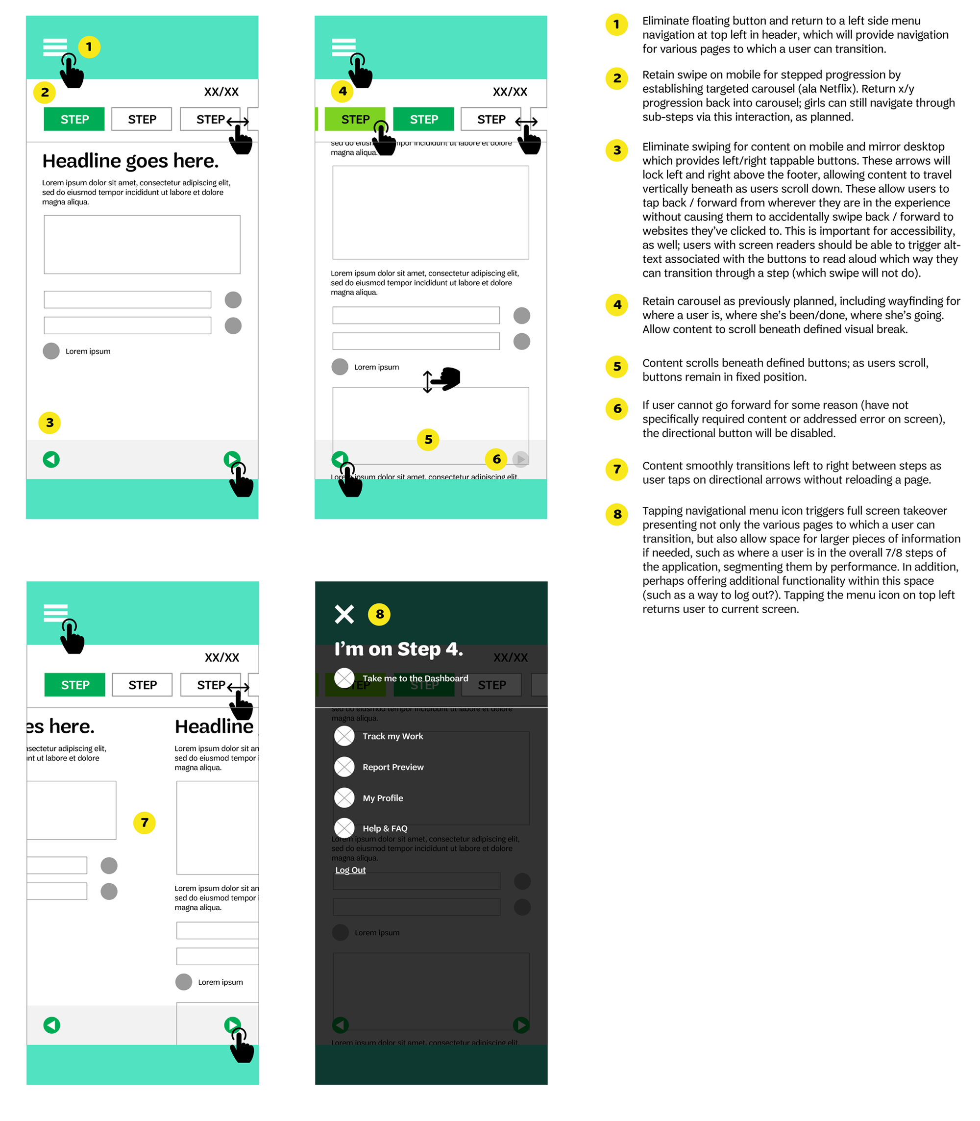
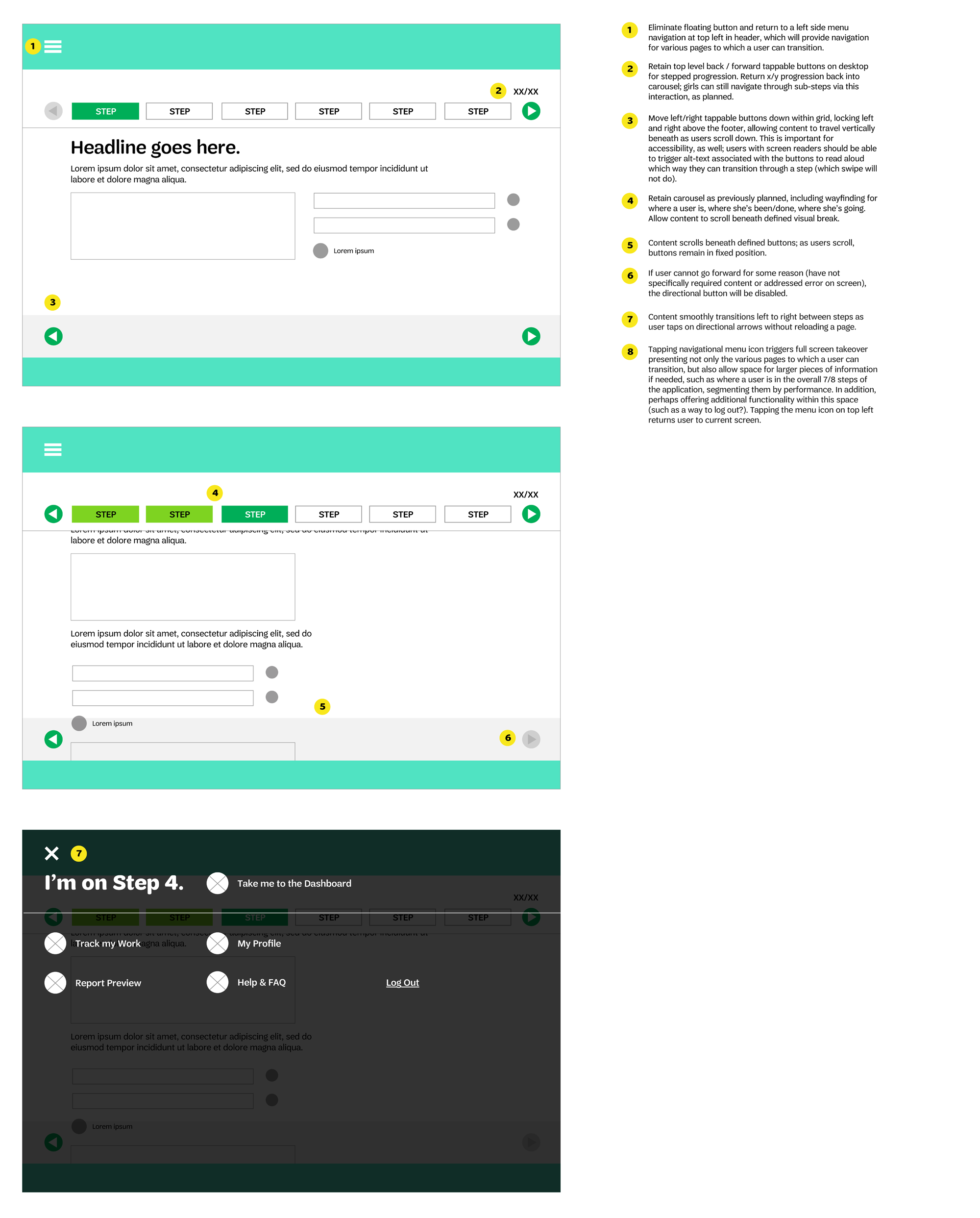
Another thing that hadn't been accounted for was how to incorporate familiar design patterns from apps or social media channels the girls would be familiar with. I proposed an Instagram style interaction for building out the girls' Experience log. Within the log, a girl could add an image or video, or a text based blog post in which she could chronicle steps she had taken while completing her Gold Award project, appearing chronologically and navigable as single cards (on desktop the user could open a single entry and click directional arrows to move between cards; on mobile, she could swipe a targeted carousel.)
Gold in them hills.
Over time, via daily and then twice-a-week reviews, I helped shape the wireframes via a process of contextual inquiry and paper prototyping along with the Business Leads. We partnered with Girl Scouts' Marketing and Communications team to establish a pattern library and Go Gold began to shine.
Additional features I helped add and define:
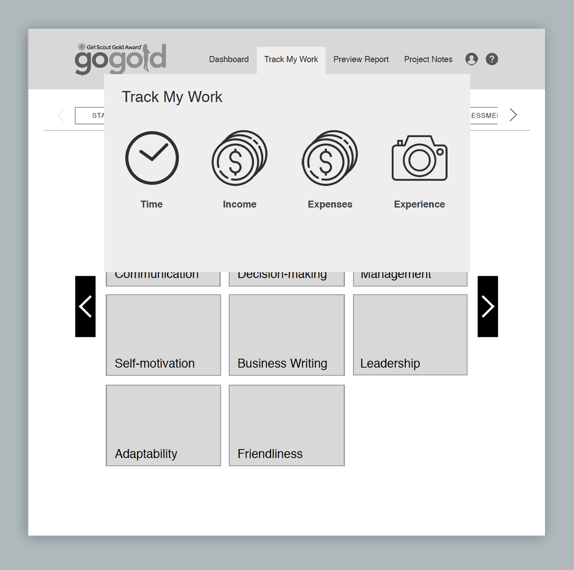
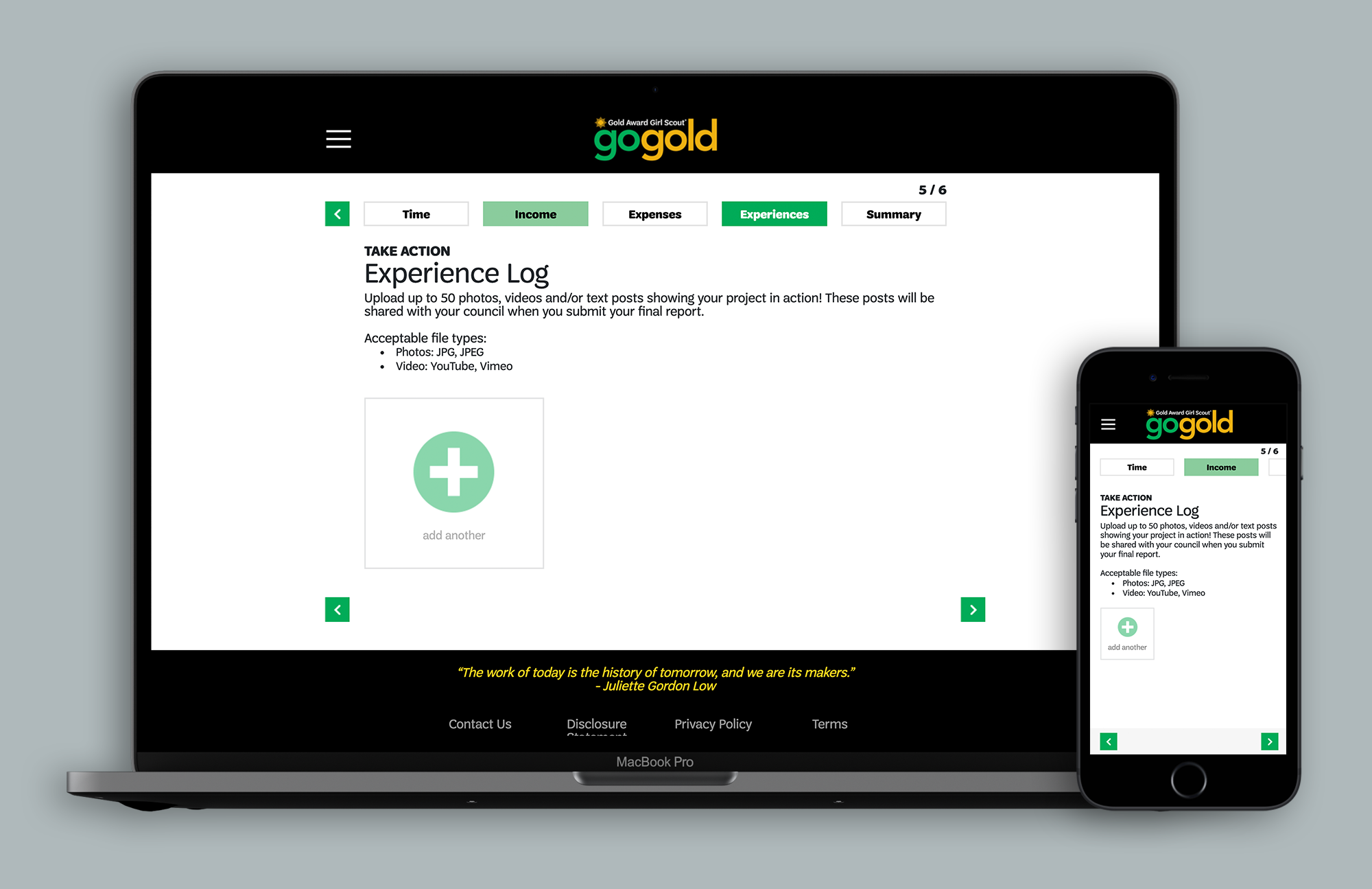
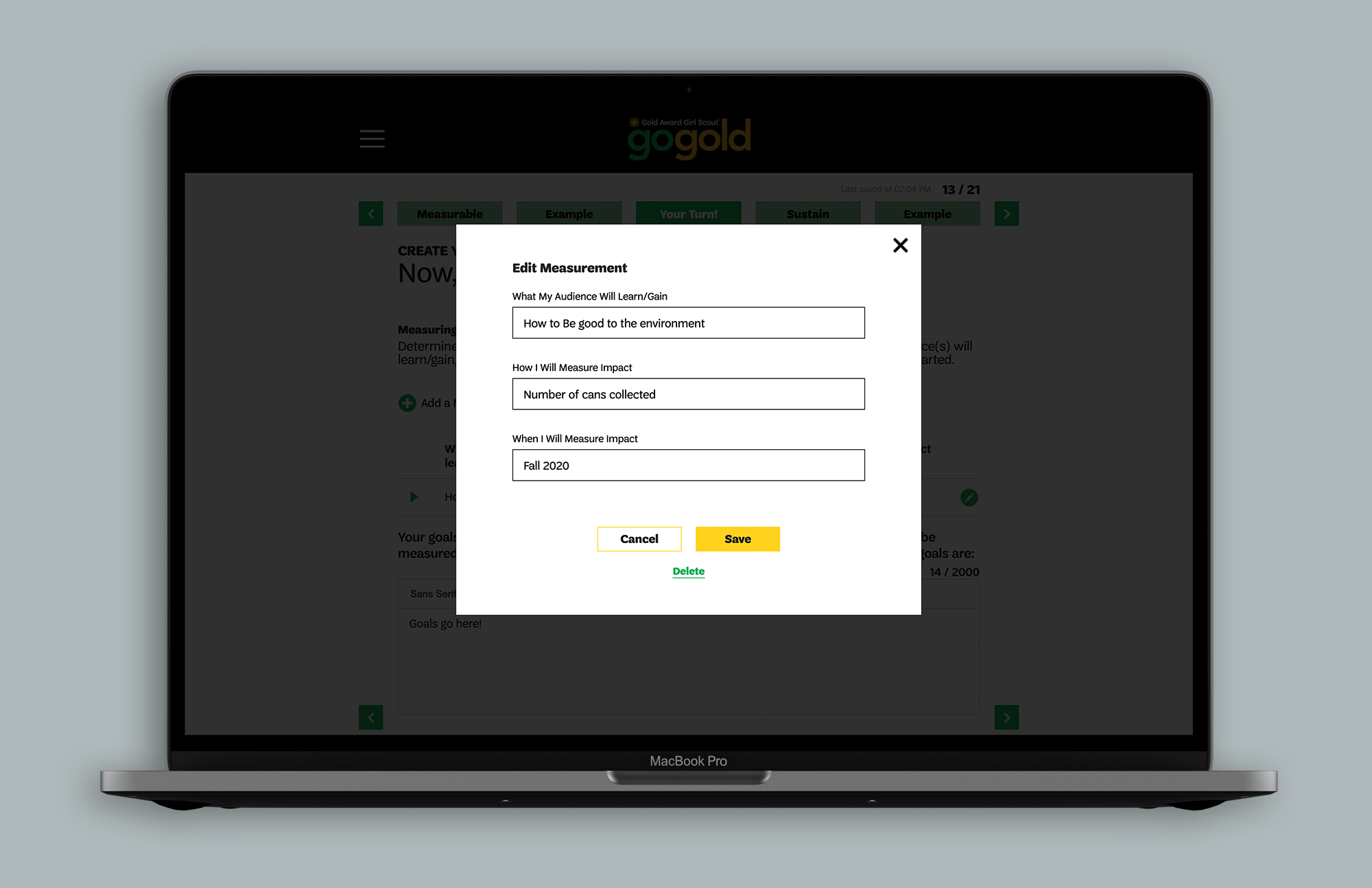
1. Robust and mobile-responsive logging flows to calculate measurements of both time and cost while undertaking the Gold Award project.
2. Best practices for signposting and communicating.consistent progression from step to step and within each step.
3. Third-party integration of a mind mapping solution, to allow a girl the option to brainstorm her Award project and process, along with prepping answers and solutions for her application.
4. The addition of drag-and-drop solutions for uploading support files to the application on desktop, rather than just browse capability.
5. Toast messaging to the girl at each step, to give her an understanding of which steps were still read-only until staff members approved her application, as well as whether or not she could apply for the National Gold Award when the season came around.


As we moved out of design and into development, I partnered with the Business Leads to establish a process of checking and cataloguing bugs, which formulated the basis of our user acceptance testing and ultimately was transferred by the developers into a ticket tracking system in JIRA.
An awarding—and rewarding—digital experience.
Though the project started with several obstacles, my involvement as the key UX/UI stakeholder allowed Girl Scouts to ensure it's new mobile-responsive application for its highest award was an experience that was easy-to-use, compelling-to-use, reflowed on multiple device types and helped Gold Award applicants keep better track of their progress during a difficult process. The experience has been widely adopted for use—particularly on tablet devices—by the girls across the organization, and helped streamline the process for those staff members receiving multiple applications throughout the year.